Nobody could agreed on what was driving churn
Smith.ai’s leadership had named churn reduction the top company-wide priority for the year, and Product Design was on the hook for a real share of it. Customer complaints were piling up and lived in three different places (Customer Success had one view, Operations had another, Engineering pulled from a third).
Every team was working from different numbers, and prioritisation conversations kept stalling into opinion. We rarely got to a phase-two on any fix because we never knew what had actually changed for customers. On top of that, leadership wanted us working from a curated set of figures rather than the raw system data:
“Use [redacted]’s numbers, don’t pull directly from the system” — Leadership
The most obvious illustration of the problem showed up in Slack. Leadership would post a single customer complaint to a channel, and because a high-value customer had raised it, we’d drop everything to investigate. Nobody could say whether it had happened once or four hundred times. We were prioritising on volume of attention, not frequency of occurrence.
One ranked list every function could work from
Surface and prioritise the issues actually driving churn. Build it so Product, Engineering, Design, Ops, and Customer Success could all have the same conversation from the same numbers, no matter who was in the room.
Manual tagging gave us categories, not patterns
The existing complaint tags only ever surfaced three things: a category, how often it appeared, and the MRR attached to it. Some of those categories (‘never used services’, ‘disconnects’) were far too vague to reveal anything actionable; they grouped problems that needed completely different fixes. I wanted pattern recognition at scale, while keeping the ability to rank by the type of work a fix needed, its MRR, and its frequency. That combination is what an AI pass could do and a tagging scheme couldn’t.
This was one prong of a wider bet: we needed far more data about reports themselves. Get a complaint, generate a structured evaluation from it, and run that evaluation against new calls and historic calls alike. Engineering had built some of these evaluation tools first, but they were disconnected from each other and not usable as a flow. I tasked one designer with auditing them against the vision I’d set, so the pieces became a single connected pipeline rather than a set of orphaned tools.
Built the pipeline. Set the cadence. Aligned five functions.
Set up the cross-functional alignment first. I convened a churn data and alignment meeting before any of the formal work began. CS, Product, Engineering, and Design partners in the same room, agreeing on what we’d measure, where the data lived, and how we’d handle reporting. The infrastructure conversation came before the design conversation.
Bucketed against the existing failure taxonomy. The system already classified calls into three mutually exclusive categories: Request Confusion, Preventable Disconnect, Configuration Error. That mutual exclusivity is what made them usable as the first cut for pattern analysis; compound categories let the same issue get double-counted across buckets.
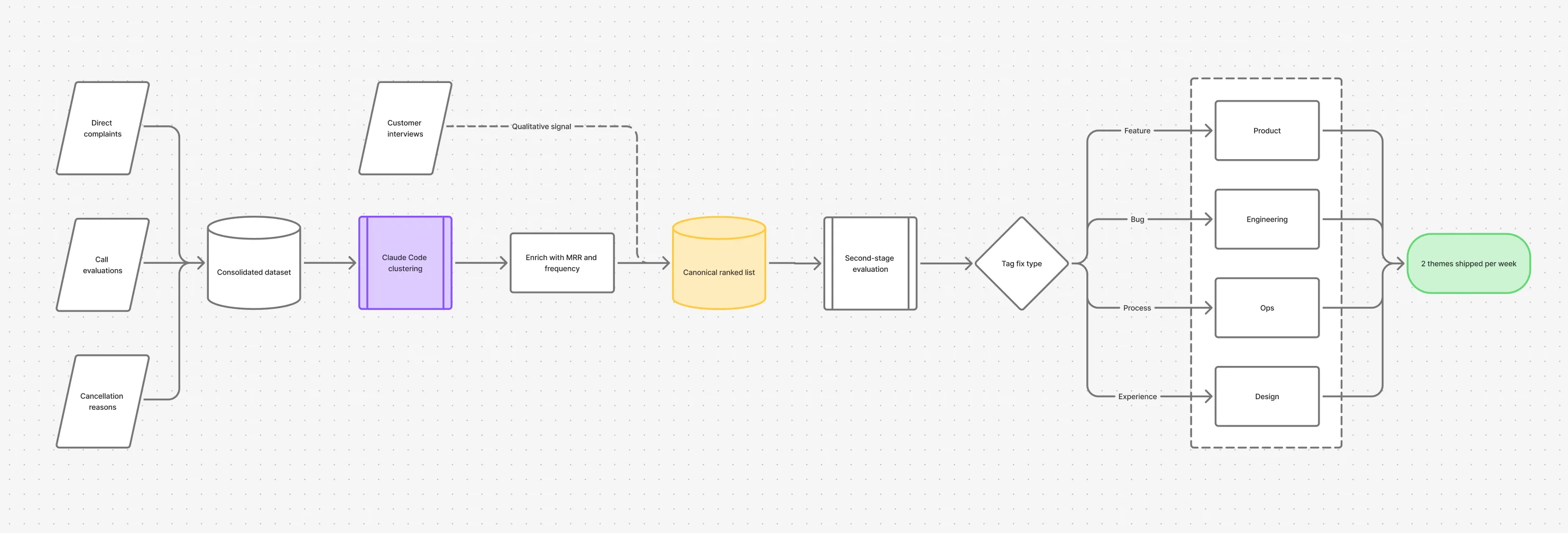
Built a single source of truth. Consolidated cancellation reasons, call-level evaluation outputs, and direct complaint signals into one structured dataset (around 1,400 complaints across the analysis window), with each entry linked back to the originating customer, the call, and the customer’s MRR.
Clustered complaints into themes with Claude Code. I ran it in two passes. The first bucketed the consolidated dataset against the existing Core Problem × Core Concern labels and ranked those buckets by MRR. The second grouped each bucket into specific, named themes (for example ‘AIR misreads spelled email addresses’ rather than a vague ‘email issues’), so the same underlying issue landed in one place however the customer had worded it; ‘AI keeps hanging up’, ‘calls dropping’, and ‘preventable disconnects’ all rolled up together. That gave roughly 115 discrete themes, each one a single ClickUp entry with its structured data and a working hypothesis.
Enriched groups with MRR and frequency. Layered each cluster with the customer plan value and the number of times the issue had appeared. Prioritisation moved from ‘loudest customer’ to ‘highest business impact’. Frequency alone stopped being the answer.
Set a fix-per-week cadence. Two themes shipped per week against the ranked list. The Product Design Strategy was rebuilt around this rhythm. Improvements shipped on a predictable cadence, and each complaint reduction tied back to a specific theme we’d addressed.
Delegated with explicit output requirements, not tasks. I handed the recurring theme analysis to one of my reports with a defined brief: framework plus solution proposal by end of week, two themes per week to engineering, latitude on methodology, working sessions available when she wanted a sounding board.
Added a second-stage evaluation per theme. A separate automation handled the engineering data requests for each top-ranked theme, pulling the call tracelogs, transcripts, and the system prompt live at the time of each call into its ClickUp entry. From that evidence the pipeline proposed a fix direction, tagged it as bug, ops change, UX fix, or new feature, and auto-assigned it to the right team:
- Bug → Engineering
- Process → Ops
- Experience → Design
- Feature → Product
I added one rule to the ranking: a new feature was the lowest-priority fix type. The system was already becoming far too complex for its existing instruction interface, and adding surface area to fix a complaint usually created the next one.
Built and demoed the infrastructure before proposing it. When I announced the system, it was already running (grouping, MRR cross-reference, engineering request automation). Approval cycles shortened because the question stopped being ‘should we’ and became ‘when’.
Where it was rough, and what I’d change
The first clustering pass wasn’t grounded in the constraints of our actual system, so Claude confidently proposed fixes that were simply impossible to build. The second pass fixed most of this by giving it the real context (transcripts, system prompts, traces), but it’s a reminder that an LLM’s first read of a problem is only as good as what it knows about the thing it’s diagnosing.
The way I tried to feed it that context didn’t hold up either. When I delegated the second-stage evaluations, my report added as much system context as she could by hand: screenshots, flows, constraints she knew about. Good in theory, but it was narrow, brittle, and went stale fast. What we actually needed was to hook into the codebase directly, or have an AI generate a fresh codebase summary on every production deploy, so the context the pipeline reasoned over was never older than the last release.
The second-stage evaluation helped in some cases, but the real value was the ranked list itself. The automated solutioning layered on top of it added less than I’d hoped: for most themes an engineer still had to confirm the diagnosed cause was the real one, and a designer still had to map the flow to check the recommended fix was actually viable. The pipeline got us to the right hundred problems in priority order; it didn’t replace the judgement on what to do about each one.
The hardest part wasn’t the model. It was an engineer charging ahead building disconnected tooling on the assumption that the problem was already understood, which is what left those evaluation tools unusable until a designer connected them. Getting the design seat into that loop early, rather than after the tools were built, is the thing I’d fight for sooner next time.
What the pipeline actually produced
One ranked list became the canonical churn list. Product, Engineering, and Design now prioritise from the same ranked list, and the complaint dashboard reports against the categories that fall out of the grouping algorithm rather than ad-hoc tags. Engineering pulls the bugs, Ops takes the process fixes, Design owns the experience fixes, Product owns the feature requests. Each queue comes straight from the list, so the prioritisation argument stopped happening in meetings.
A churn-driving bug surfaced that nothing else would have caught. It had been masked inside several different complaint categories until the clustering pulled it together; no single view had ever shown it as one problem.
The analysis diagnosed where the churn signal was concentrated. Two conversational failure modes accounted for roughly 95% of the complaints behind the leading churn indicator, Preventable Disconnects (where the AI dropped a call before completing the caller’s objective). That 95% is a diagnosis from the data; it shows where the churn signal concentrated, which is a different measurement from how much churn actually fell. The bug fix shipped, and the two conversational fixes were prototyped against it.
There was a churn target attached to the work, but I won’t dress it up as a result. It was a goal more than a measurement; the churn it was meant to move was never something design could attribute cleanly to one set of fixes. I was laid off before the conversational fixes shipped or their impact was measured, so the retention outcome isn’t a number I can claim. What I can show is the system that produced the diagnosis, the cadence it set, and that five functions still prioritise from the list it generated.
Team and my role
I defined the strategy, built the pipeline, and ran the cross-functional alignment; the AI clustering and the second-stage evaluation were mine to build and tune. I delegated the recurring-theme analysis to one designer on my team against a defined output brief (framework plus solution proposal weekly), and tasked a second designer with auditing and connecting the evaluation tools engineering had built. Engineering, Ops, Customer Success, and Product owned their own queues off the ranked list.
The research behind it
The pipeline tells you what’s broken; it doesn’t tell you what would have changed a customer’s decision to leave. So I ran a small parallel research programme alongside it: a cohort defined by cancellation reason and MRR, a two-part interview arc (problem-space first, then solution-space) to keep conversations rooted in what had actually happened, and incentives tiered by customer value. The qualitative signal fed the same prioritised list as the quantitative one.