We’d grown to three designers with no operating layer
It started with one other designer and me, both doing IC work even though I was the Head of Product Design. Then I hired two more, and at three designers the way we ran ourselves stopped keeping up. Leadership had no visibility into what design was working on or how far along anything was. No resourcing or pivot decision could be made without coming through me first. Some designers were burning weekends to deliver on commitments they hadn’t been part of making. Critique was inconsistent, status updates were a wall of text in Slack DMs, and I was still in the work as an IC myself, which kept things moving today but wouldn’t scale to five, six, or seven designers tomorrow.
I’d been told this directly in a leadership review: the design org needed to articulate its point of view, tie concrete initiatives to it, and show measurable progress, consistently. The diagnosis was right. So I stopped doing IC work and started building the operating layer the team needed, something that had to keep working without me, because at some point I wouldn’t be in the room.
I wanted the work visible and leadership able to redirect it
A lot of the best design work is invisible. It happens in someone’s head, in a DM thread, in a Figma file nobody else opens. The team rarely gets credit for it, and leadership can’t act on what it can’t see. I wanted to fix both halves: advocate for work that was otherwise hidden, and give execs enough visibility to know who was working on what, what stage it was at, and where to step in and redirect.
The principle underneath was ‘design out loud’: do the work in the open. Looms instead of write-ups, progress and decisions in public Slack channels instead of DMs, FigJam files open in the stakeholder meeting rather than a tidy export afterwards. Visibility wasn’t a report I bolted on at the end. It was how the work got done day to day.
I grounded the OKRs in five months of real data
Before writing a single OKR, I pulled five months of historical data: cycle time per task by work type, complaint volume by category, cancellation reasons cross-referenced with call-evaluation data. The OKRs that came out of it were defensible because every target traced back to a number. A 19.6% preventable-disconnect baseline from call evaluations. A 10-day median cycle time from around thirty completed tasks. A recurring-revenue figure at risk from call-experience churn.
I fixed the definition before measuring anything: cycle time was the calendar days from a task entering ‘In Progress’ to its spec being marked Complete. Ambiguity in the measure produces ambiguity in the result. Targets were then written against the baselines rather than picked as round numbers, a 20% cut in median cycle time (10 days to 8) and throughput up from 18 to 22 specs a quarter.
Weekly meetings and an ideal-days capacity model
I renamed ‘critique’ to ‘Show and Tell’. Dropping the word took the stigma off the meeting and got people sharing earlier and more honestly. The format was structured: a posted agenda, a Figma frame carrying context and the kind of feedback wanted (exploration, visibility, a specific question, design QA, a success check, a knowledge share), and a five-minute opener to triage. Two sessions a week, scoped to scale to double the team without changing.
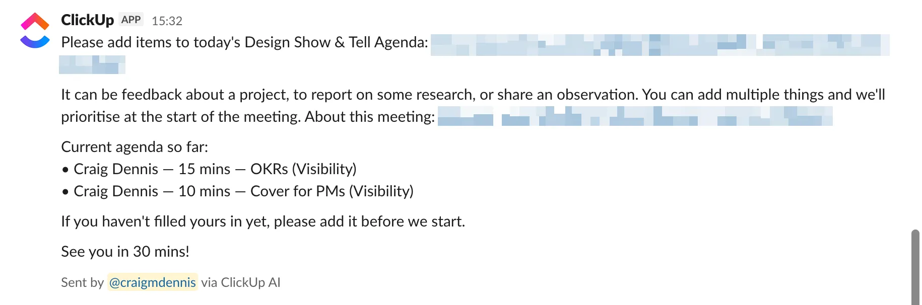
The Monday design sync did the operational half: priorities, blockers, support needs, one mandatory highlight per designer to reframe the negatives. Not a status meeting, not a critique. Its only job was to surface dependencies and unblock work in real time, and anything deeper moved to Show and Tell.
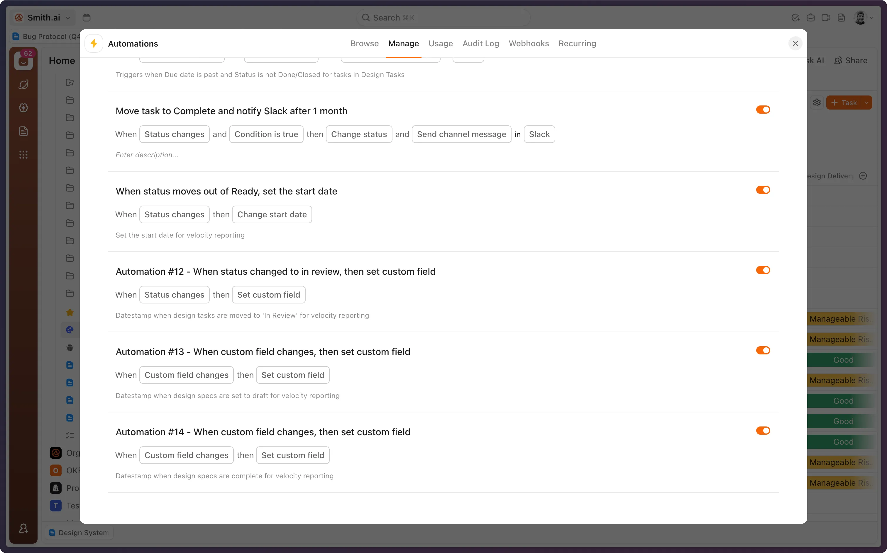
Both ran on a ClickUp workspace with five tracked fields, on a rule I held to: no field exists unless it changes a decision. Status, Work Type, Ideal Days, Design Spec Status, Confidence. When a spec was marked complete, its status auto-moved the upstream Product task to ‘Ready for Engineering’, so the handoff happened without a manual nudge.
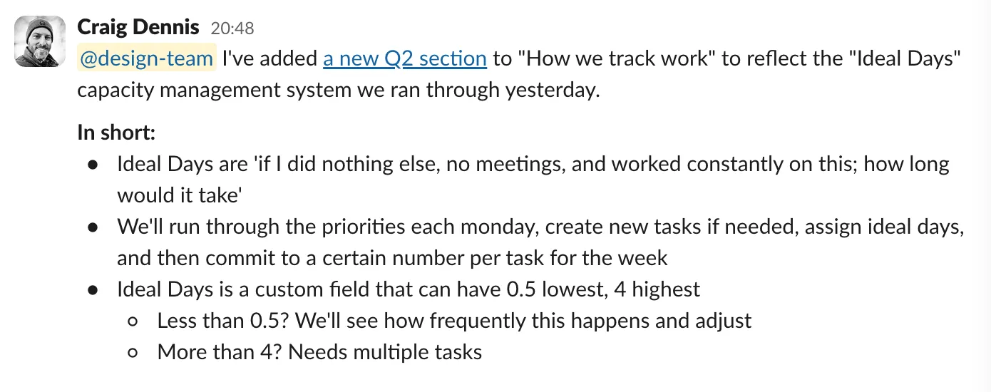
The capacity model was the part that changed behaviour. An ‘ideal day’ is “if I did nothing else, no meetings, just this, how long would it take.” Each designer has four ideal days a week, and that number is the constraint, not an aspiration. Every task gets an estimate when it’s created, anything over four days gets broken up, and each Monday opens with a check-in in two parts: review last week’s commitments against what actually shipped, then plan the week so the total lands at four or under.
The first time we ran it, it told us something we’d been circling for weeks. One designer came out at 5.5 days against 4 available. We reprioritised in the meeting: she reused another designer’s existing work instead of rebuilding, and shifted deadlines. Within the hour, she’d posted capacity-based deadlines to a cross-functional channel without anyone asking:
After reviewing my capacity this week with the design team, I’ve decided that [specific design tasks] by Friday is what’s achievable for me. — Designer after ideal days brought in
It was the first time a designer had proactively communicated commitments across teams. Overcommitment had gone from something you discover when a deadline slips to something you see before it ships.
The work itself sorted into three tiers: Product-led (the roadmap, around 60%), Design-led (the 20% the team owns for problems it surfaces itself, like call listening, data analysis, and CSAT signals), and Craft (design system, tooling). Designers protected their own 20% by default, and leadership could see the split in the dashboard.
A dashboard and a monthly leadership report
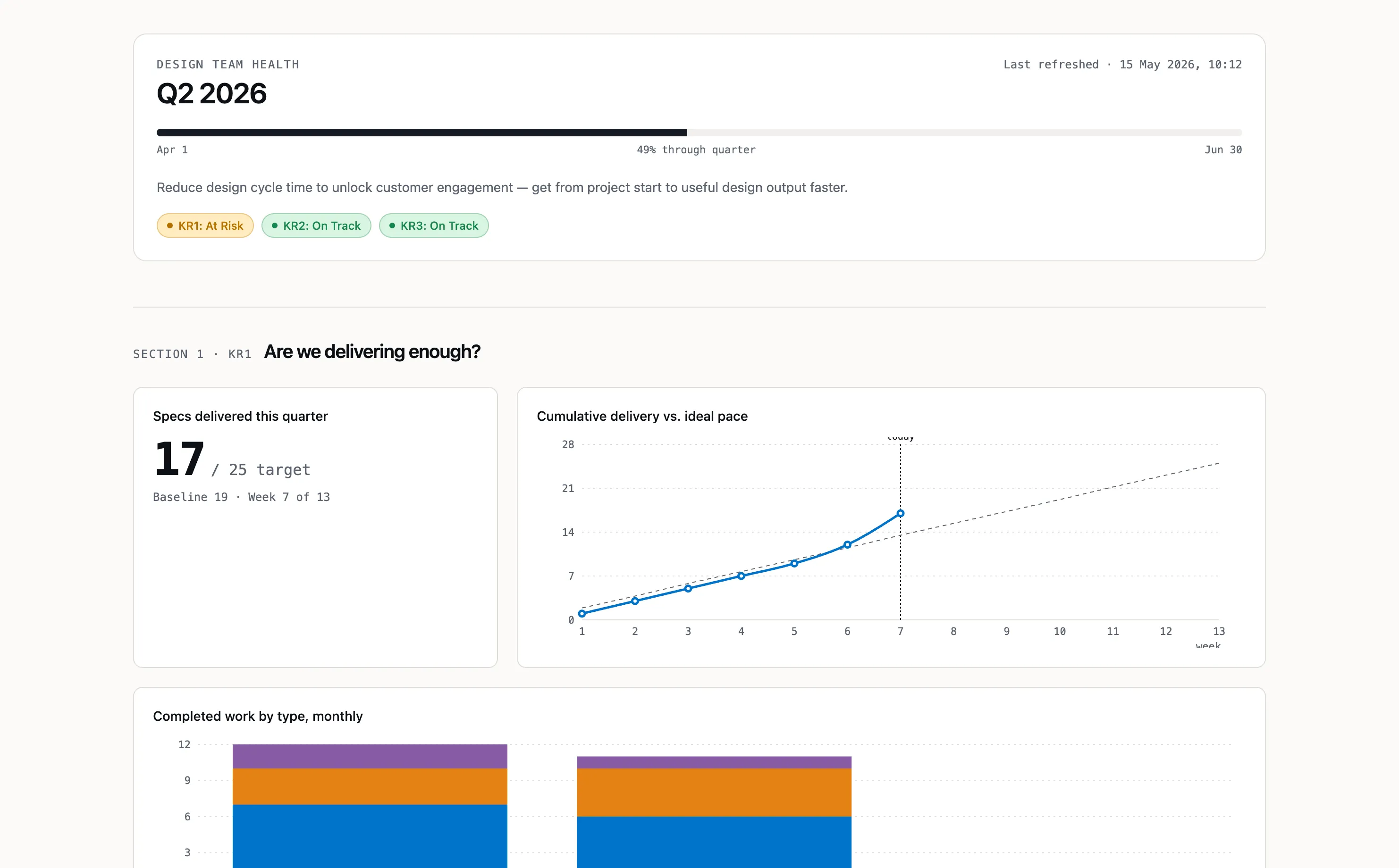
ClickUp held the data but couldn’t produce the report I needed: separating active time from time spent waiting, tracking median cycle time by week against baseline. So I built a custom dashboard with Claude Code that ingests the CSV export and shows cycle-time trend by month, throughput by work type, and OKR progress against target.
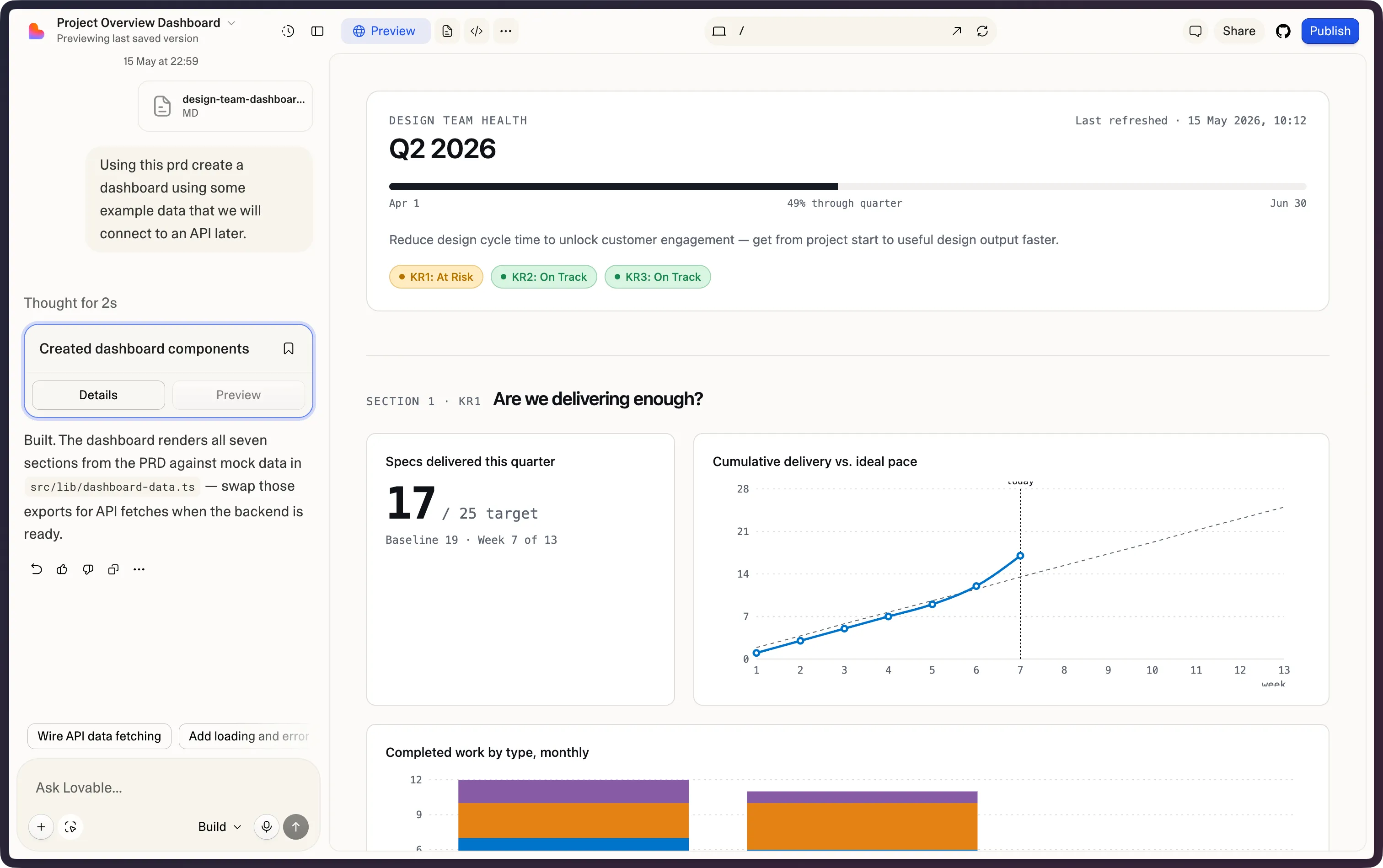
The first thing it surfaced wasn’t about how fast designers designed. It was how long work sat waiting. Tasks were spending more time in review queues than in active design, so I fixed the review process before touching anything else, then layered in AI tooling for spec generation on top.
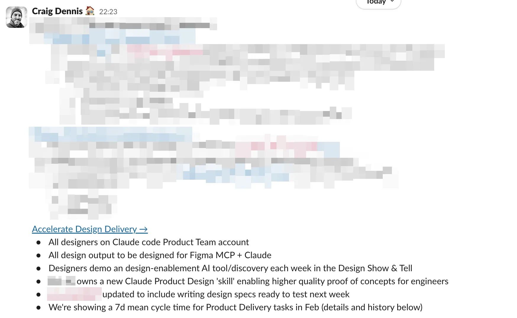
On top of the dashboard went a monthly leadership report on a fixed cadence: OKR progress against target, posted in the same week each month, dashboard linked. Deliberately structural, data table first and narrative second, so leadership could scan the movement before reading the story. After the third report my manager asked me to frame each activity within the broader strategy, because the rest of the org needed to understand it. That feedback shaped the fourth: every initiative reframed as the execution of a specific strategic bet, not a standalone win. The cadence was the format; the framing was the discipline. I even ran a monthly poll in the design channel to check the meetings themselves were still earning their place.
Cycle time fell 60%, and the system ran without me
Median design cycle time fell from 10 days to 4 over three months, a 60% reduction against an OKR target of 20%. The mean came down with it, from a 15.9-day baseline to 7 within the first month.
The honest version is that part of that drop came from changing what counts as a task. We used to treat one project task as one design task, so a single design task could sit open for weeks, carrying a large and loosely-defined pile of work. Capping every task at four ideal days broke that into smaller, discrete pieces. Some of the gain was real: fixing the review queues took genuine waiting time out. But a lot of the headline number is simply that the unit of work got smaller. Each piece moved faster, while the overall project didn’t necessarily ship any sooner.
What genuinely changed was the granularity. A task sitting ‘in progress’ for three weeks tells you nothing. A task in progress for six days against a four-day estimate tells you exactly where to look.
The real test came in the last quarter of the year, when I was on parental leave. The syncs shifted from Monday to Wednesday and kept running. The COO went to my dashboard to find out who was working on what. My next-in-command ran the syncs and made the tie-breaker calls, and the team shipped at the same cadence. The system worked without me in the room, which was the whole point.
Design had become legible to the business. Leadership now had what it needed to make resourcing calls: which work is product-led, which is design-led, where confidence is low, who is over-committed. And the monthly report that didn’t exist a quarter earlier now anchors the conversation, the same numbers the team commits to on Monday rolling up to the numbers leadership reads at month end. By the third consecutive report, the cadence itself was the credibility.