As a designer I like things to work well and look pleasing. The same is true for my resume. When applying for jobs over the past year or so I have designed many different versions; some more pleasing than functional.
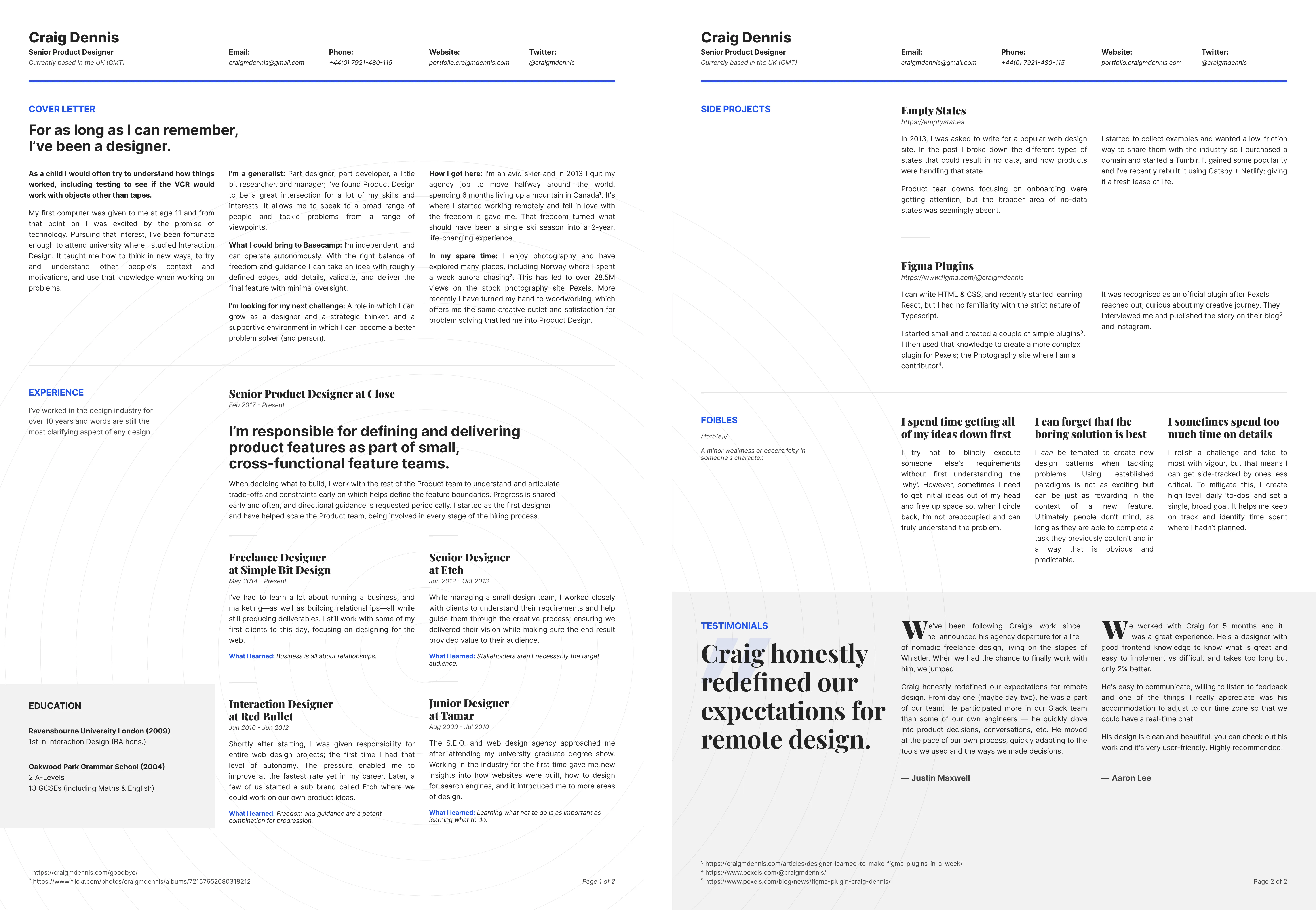
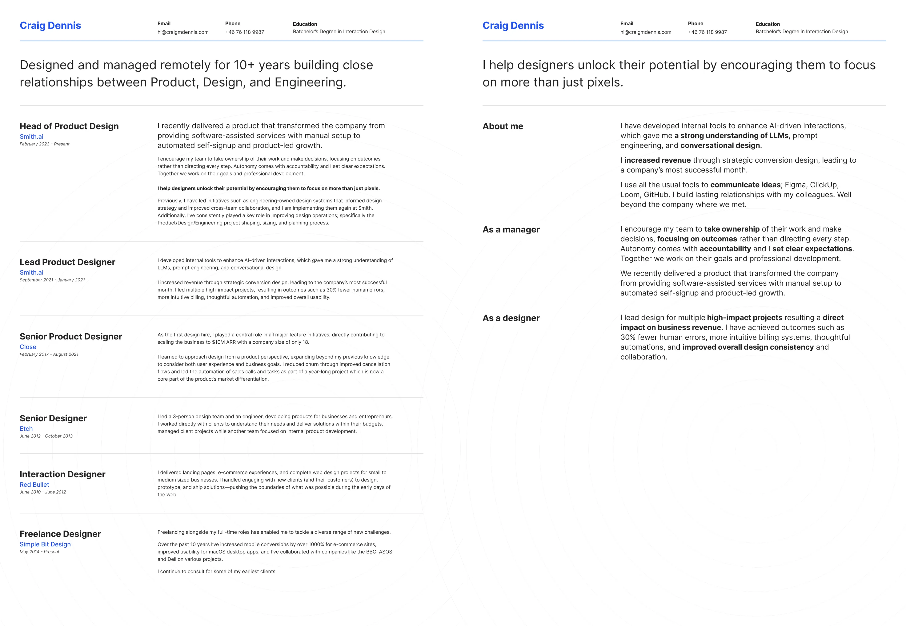
Having been on the hiring side many times, I know what information a few ATS products surface about a candidate, how the filtering works (or doesn’t), and how—ultimately—recruiters are absolutely worth the money.
What I thought was an expression of my skills turned into a deep dive into how applicant tracking systems actually parse PDF documents and how I’d been harming my chances when cold applying by not understanding how computers were reading my resume.
It turns out that multi-column layouts break ATS parsing because of how PDF/Word text extraction actually works: it reads text in content-stream order (the order objects were written/drawn into the file), not true visual/spatial reading order.
In a single-column resume, drawing order naturally matches top-to-bottom reading order, so extraction “just works.” In a multi-column layout, that assumption breaks down which can lead to job titles and dates being mixed up or detached from the actual role descriptions.
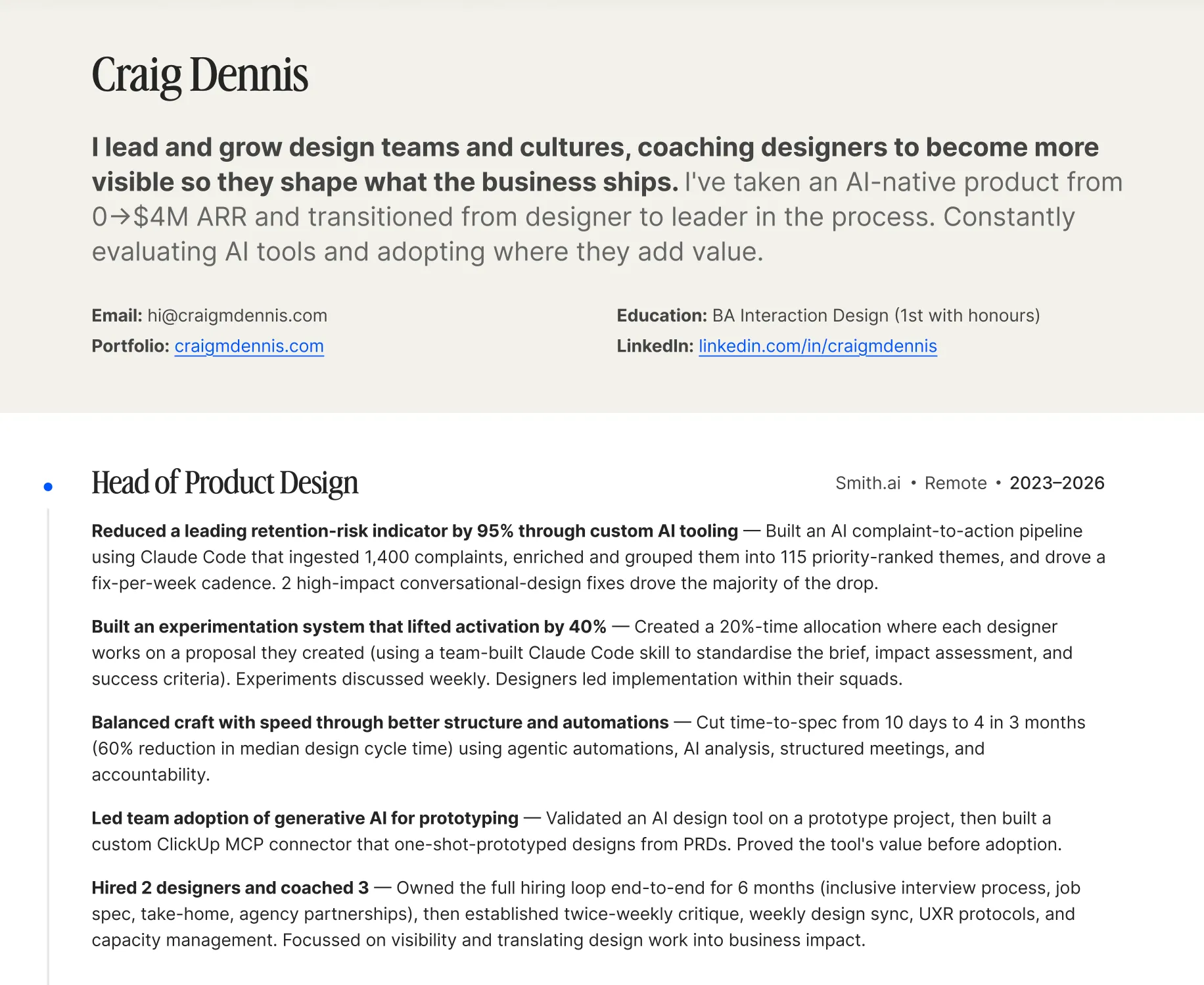
At first I ran this though Claude, which can read all the information fine, and it say “yeah, this is fine”. LLM-based parsing would be expensive on a token basis (and so I made an assumption that ATS platforms use it sparingly) so I asked Claude Code to do the same and it suggested using some python PDF parsers commonly found in ATS platforms.
Oh my… The content it read (especially in a multi-column layout) collapsed my beautifully designed layouts into a mash of text and symbols that was hard to read.
- Incorrectly extracted symbols: The → arrow icon got extracted as a trademark symbol (™) and the line then wraps mid-number. The glyph substitution happened because the arrow was drawn using a font glyph that PyMuPDF mapped to the wrong Unicode codepoint on extraction. Icons/dingbats in resume templates often do this.
- Stray characters: after
Email: hi@craigmdennis.comand afterEducation: BA Interaction Design (1st with honours), there’s an orphaned(on its own line. Likely a bullet/icon glyph (a phone or link icon) that partially extracted as a leftover parenthesis fragment rather than clean text. - Missing date range separator: The same date range with three different extraction results (
2023 2026** vs**20212023** vs**20162021) depending on how much horizontal gap was between the year and the dash.2023 2026still has a space (readable), but the others concatenated completely. The en-dash/separator between the years didn’t extract as any character at all, so the two years fused into one unreadable number. - Missing bullet glyphs — lines like
...custom AI tooling \n Built an AI complaint...show a bullet character that extracted as nothing (just leftover whitespace and a line break), so what was visuallyPoint A • Point Bbecame two fragments glued together with no separator ATS-side. Unreadable.
This blew my mind and I knew I had to fix it before my next application.
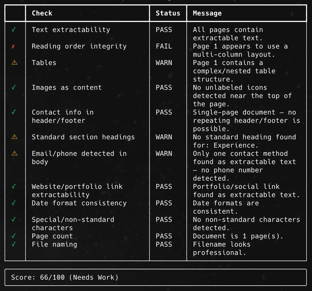
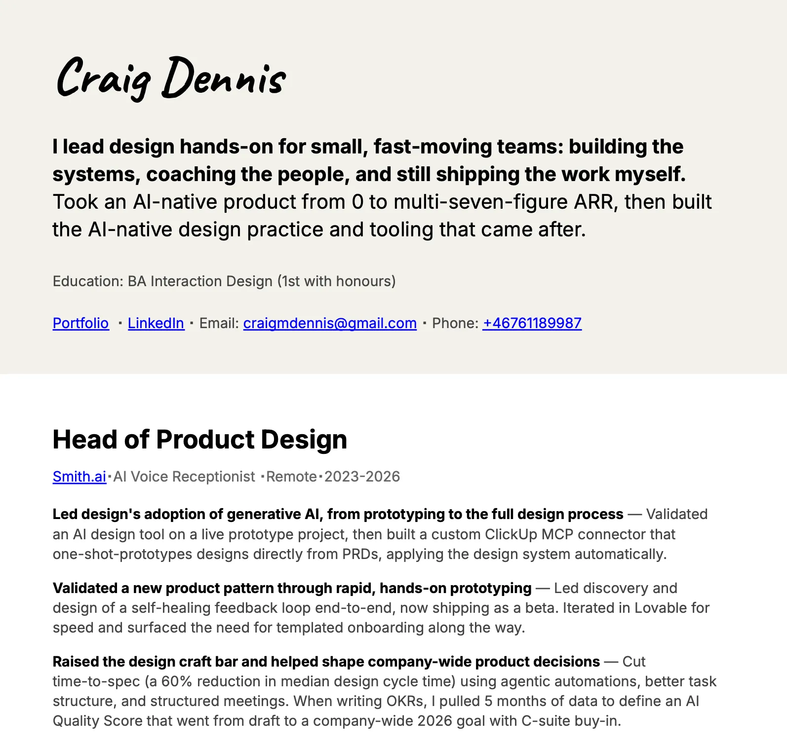
I reluctantly created a super-simple version in Google Docs. I had to add some creativity so I positioned a shape behind the header to match my website. The hand drawn text also conveys my thesis that ‘advanced technology needs more humanity’.
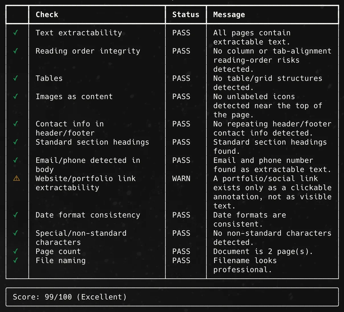
The score it produced was nearly perfect. With only one suggestion.
The hardest lesson to learn here is one that I keep coming back to throughout my career: the constraints of the system determine the functionality and within those constraints I must try to create something beautiful. If I try to create something beautiful without knowledge of those constraints, then I end up not delivering on what is actually needed.
Craig Dennis - Smith.ai | LinkedInI'm a product designer who recently led design on an AI-first voice service for SMBs that… · Experience: Smith.ai · Education: Ravensbourne University London · Location: Sala · 500+ connections on LinkedIn. View Craig Dennis’ profile on LinkedIn, a professional community of 1 billion members.