The best UI is no UI
Users should never be thinking about an interface while they’re using it; instead the interface should be unobtrusive and functional. There shouldn’t be any decoration when efficiency is the focus.
“Good design is invisible. Minimum input, maximum output, with minimal conscious thought.” — Oliver Reichenstein
Forms
Everyone is familiar with a web form. Login, register, update status, comment — all of them follow a similar pattern which is usually a label, an input, a placeholder and a button.
There has been a shift away from labels in favour of using placeholders for the same purpose, but this can lead to some usability issues because the placeholder disappears when you start typing. It may also affect accessibility if the label isn’t even in the markup.
There are some clever ideas to get around the issue.
In The Wild
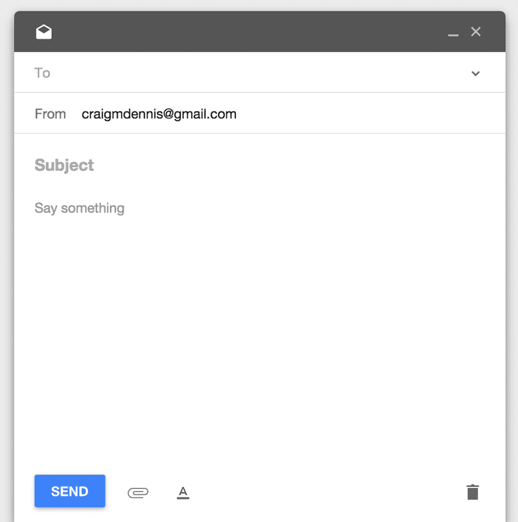
The ‘new email’ form for Inbox by Google shows how typography, visual hierarchy and colour can combine to create a fantastic interface design pattern without an explicit UI for content. It plays on our innate sense of writing; start with a title and then add some copy.
It is clear from the size, weight and position of the text at the top that it is the title (Subject in the case of email). It’s also clear that the subsequent text is secondary and relates directly to the title; even when the placeholders are removed when typing. The placeholders serve to reinforce what content is expected.
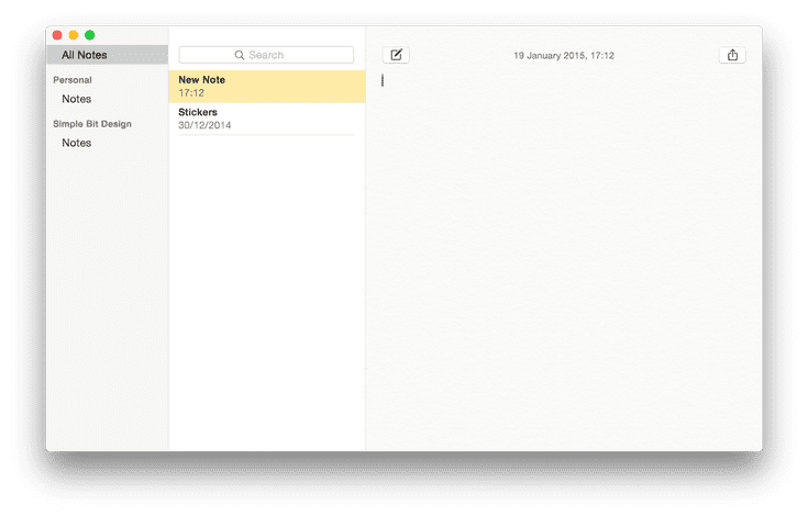
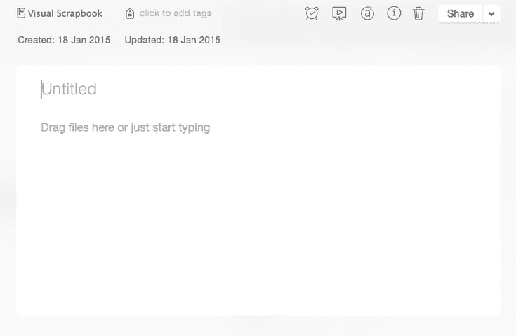
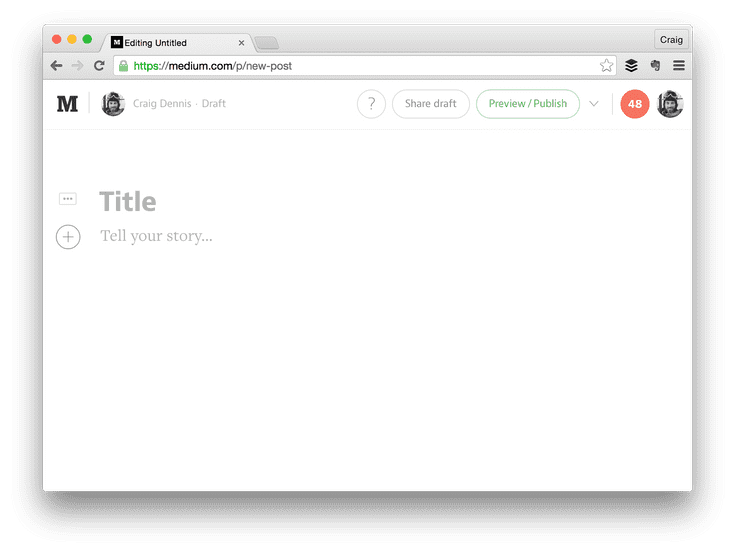
The main difference is that there are no separate fields for title and content. It doesn’t care as notes are — by their very nature — freeform.
There is an easy way to tell if you’ve been successful in removing a form field interface: Can you still understand the field’s purpose when it’s populated by user content. Without a persistent label, content is all anyone has to go on.
It’s a little like skeuomorphism in that design elements are used to reinforce the real-world instances of their digital counterparts, allowing them to be easily understood.
Visual grouping plays a very important part in forming relationships between content, thereby giving it added context.
More examples
In Practice
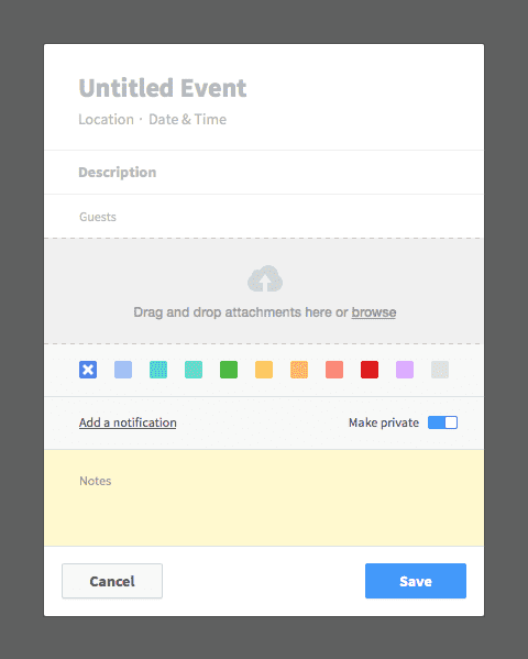
I’ve applied these design principles to a ‘new event’ in a fake calendar app.
The placeholders serve to initially explain what content is required in each field. The visual hierarchy helps explain the context of each item when the fields have been filled.
- Untitled Event shows that the event needs a name. It’s at the very top and is the largest element indicating that it’s the most important.
- Location auto expands to take a full / partial address or just a meeting room. Easily recognisable content once filled.
- Date and time would prompt a picker of some description or take any form of date / time combo written
- Description is bold to indicate it too is a title of sorts. This could be used for an agenda or general overview of the event. More detail would go in the ‘notes’ section.
- Guest would trigger an autocomplete dropdown to select contacts (with avatars if present) but will also just accept a comma separated list of email addresses.
- Attachments would show a list of files once attached but having a drop-zone and a browse link easily indicate the purpose.
- Notifications might be better called ‘reminders’ as date and time by itself has no discernible meaning in this context. ’Remind me X hours/days/weeks before’ would be a good option.
- Notes is a dumping ground for any freeform content. It could be the entire agenda, cliff notes or anything not included in an attached document.
The important thing to note is that most of the inputs can be easily understood once they are filled because their content types are different.
Where the content types are the same (as with the title, description and notes) visual hierarchy, layout, typography, and user content, all go towards showing the context.
How far can this go?
This isn’t something that should be applied in a blanket fashion to all forms. For example: a long, detailed car insurance quote form wouldn’t work because the content can’t be understood without a label; it’s too detailed.
However the registration plate, make, model, and colour could be addressed with invisible UI if designed correctly.
Another approach is Progressive Reduction which starts with a full interface (including more verbose wording and help) but gradually reduces the amount of interface the more you complete specific tasks.
TL;DR
An interface typically includes icons, buttons, toolbars etc. but not all of those elements may be needed.
We’re good at reducing unnecessary tasks by asking:
“What is the minimum information we need from a user?”
Now we should be asking:
“What is the minimum interface the user needs?”
