Designing for the empty states (10 years later)
In 2013 I wrote an article outlining an often overlooked part of design; the empty states. A lot has changed in the 10 years since and it's time to revisit the topic.
In the absence of expected information, provide context and actions so people understand what they're seeing, why, and how to fix it.

Traditionally empty states were overlooked as most designers focus on how best to display lots of content or data and not the lack of it.
It’s common for empty states to be dealt with by developers because the causes are often exceptions (such as no internet connection, no permissions for location, a failure to connect with a database). Developers often write the copy or it is provided by a backend service to help debug a problem. As a result it can be a little stiff and literal. While this is better than nothing (and functional), empty states should be deliberately considered.
There are three main empty state types:
First use (e.g. creating new data)
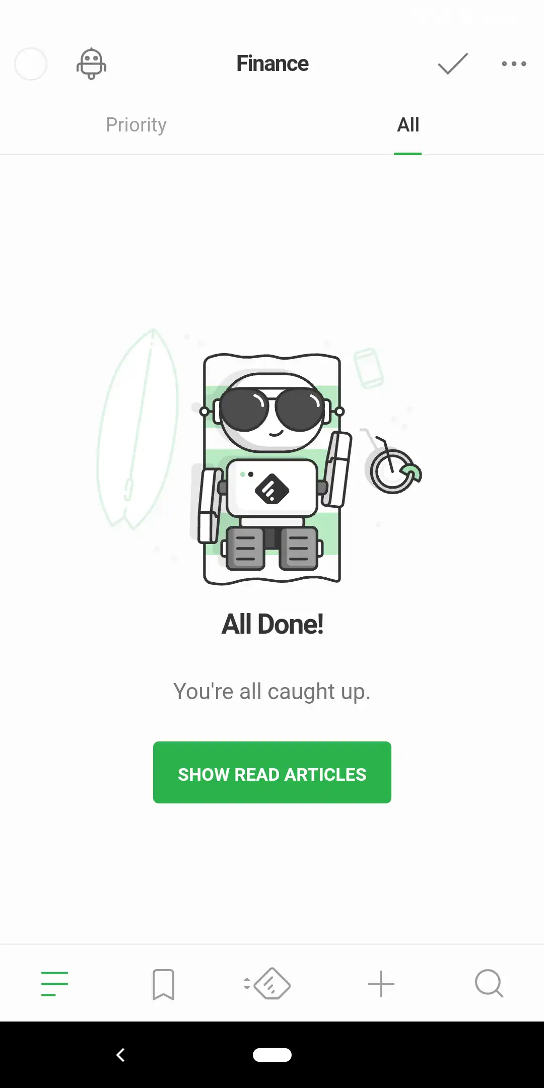
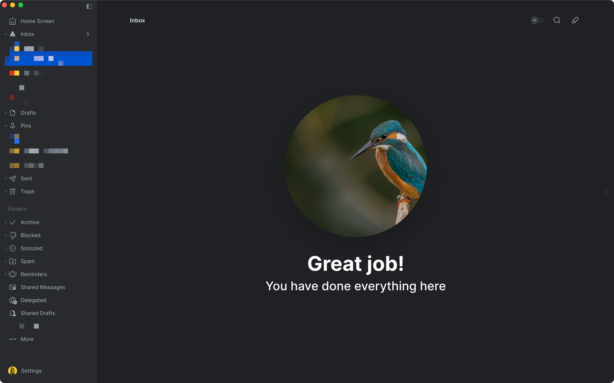
User cleared (e.g. deleted data)
Errors (e.g. unable to load data)
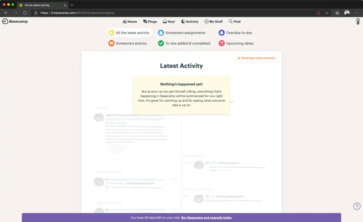
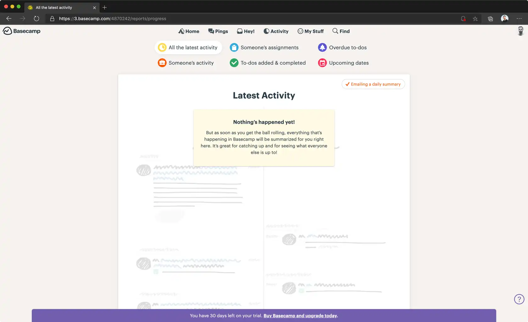
First use
From meeting new people, visiting a new place, or learning a new app, first impressions help us predict what will happen by comparing what we see now to something we have seen previously; an existing mental model.
Sometimes there is no basis for comparison (users are presented with a blank canvas). This can often lead to people believing the app is broken because nothing of meaning is loading. A bad first impression is very difficult to overcome.
When someone signs up for an app, the chances are high that they know what it does. It may not be clear to them how. When you sign up or log in for the first time, there is no data. It is the perfect opportunity to provide some careful hand holding to help users get the best possible experience. If the lack of data is out of their control then tell them; put them at ease and show that your app has some personality. Have a look at the way Buffer, Timehop and Dropbox do this. Buffer uses the same technique on their desktop site showing that it doesn’t matter what platform or screen size you’re on.
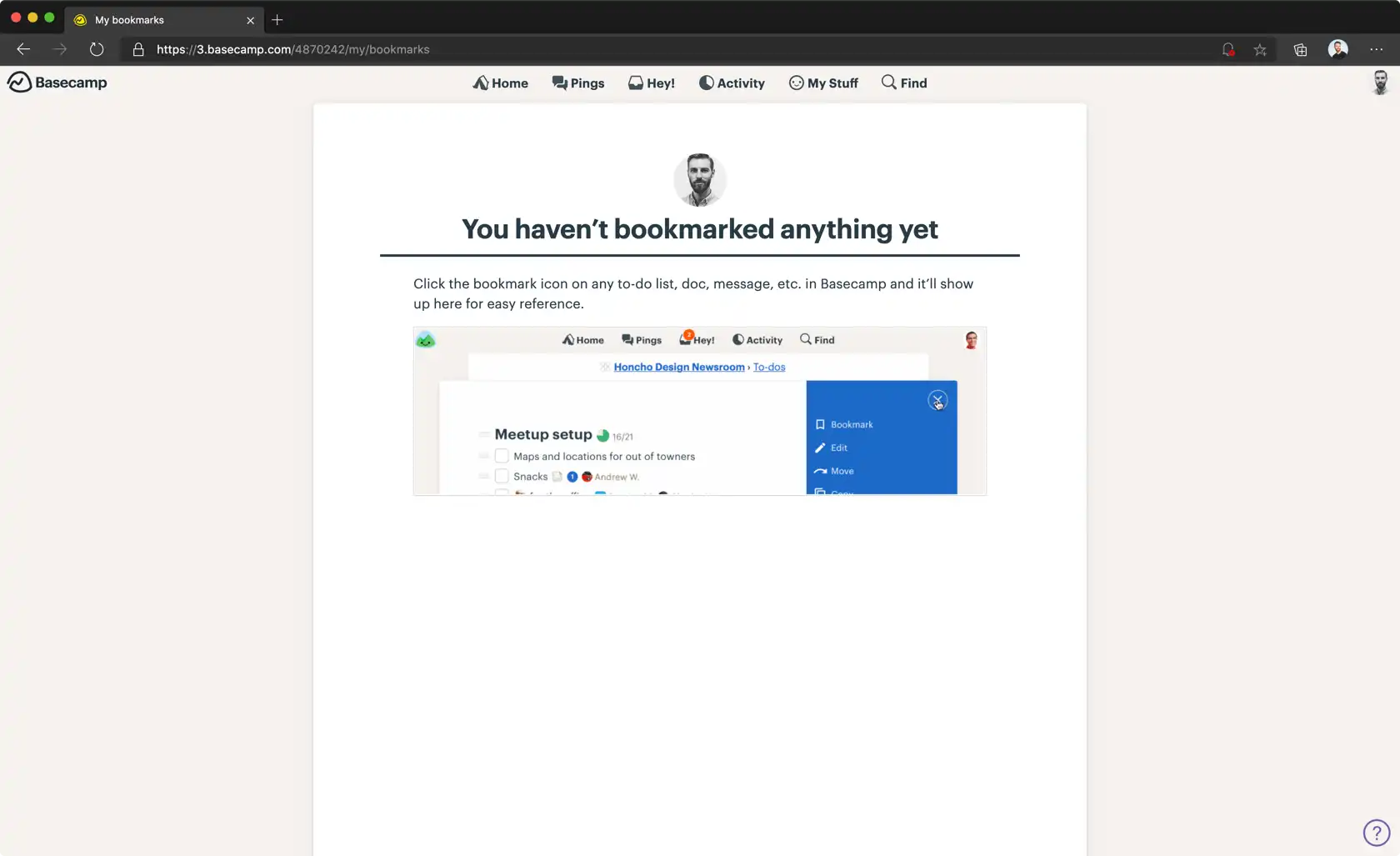
User cleared
Consider the inbox. Love it or hate it, most of the time it’s full. Some people have hundreds of unread emails. Some people have only a handful. Either way everyone is on the quest for ‘Inbox Zero’ whether they know it or not. This can be a monumental task and as such should be rewarded with more than just relief.
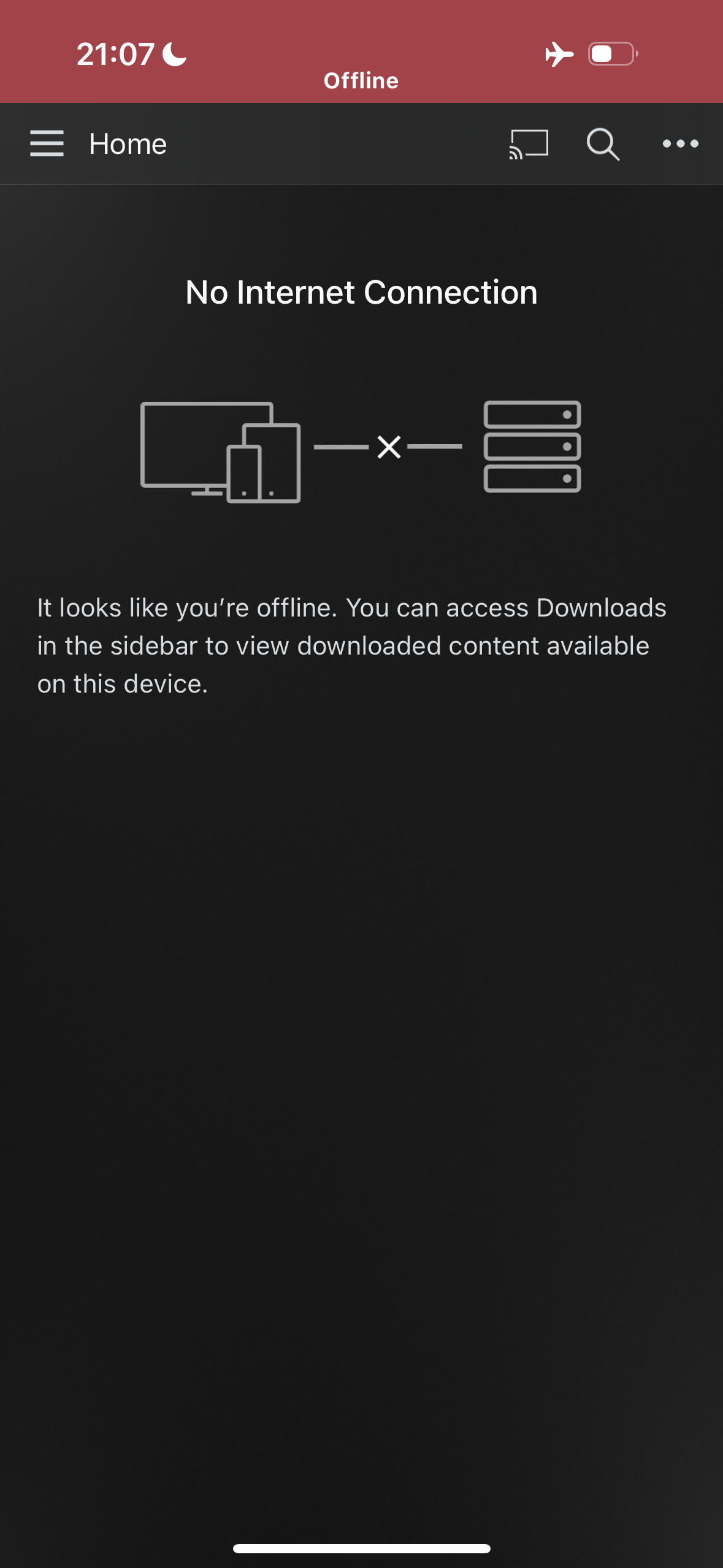
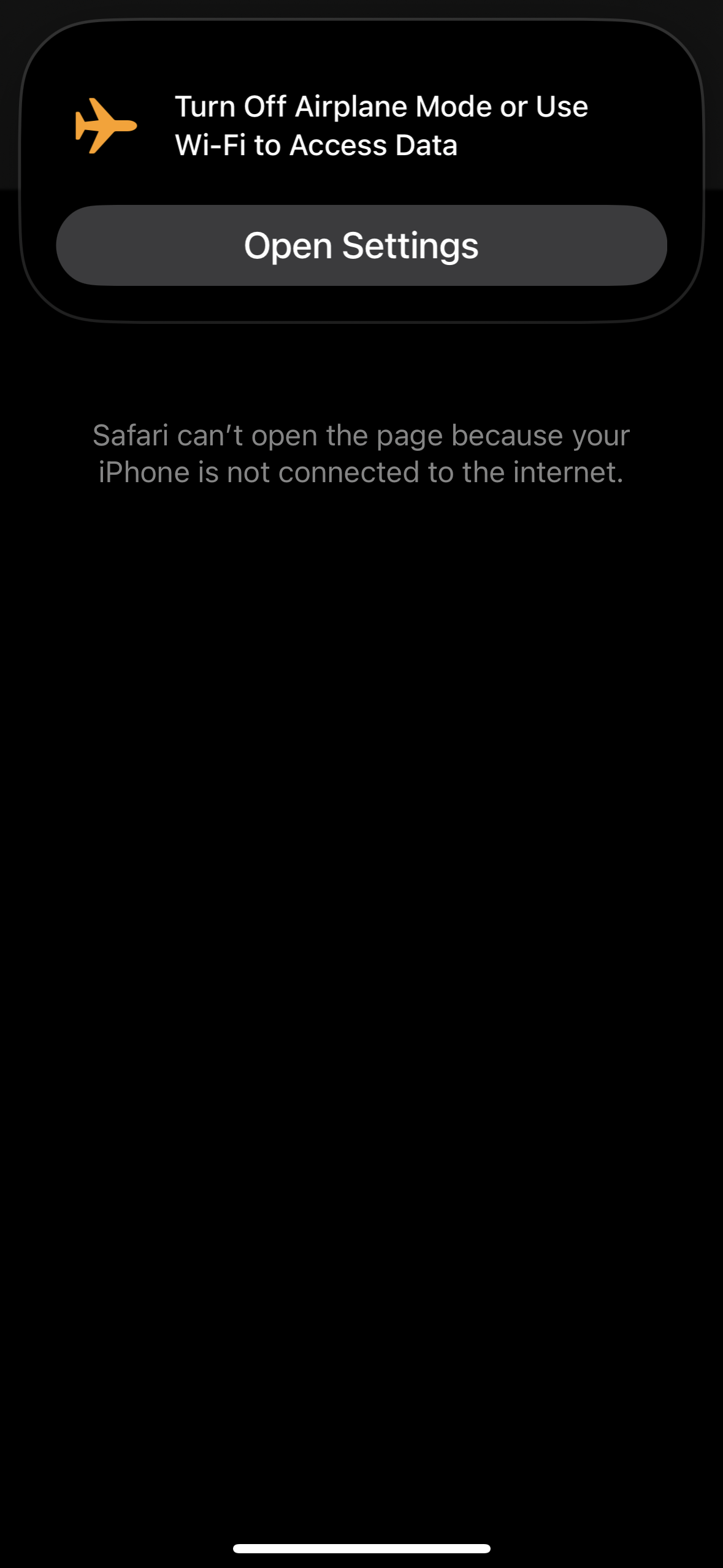
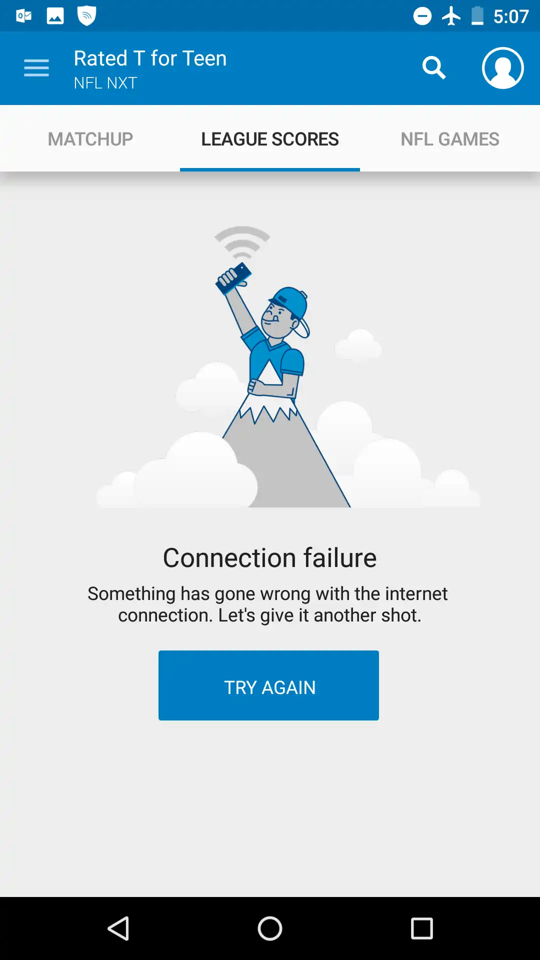
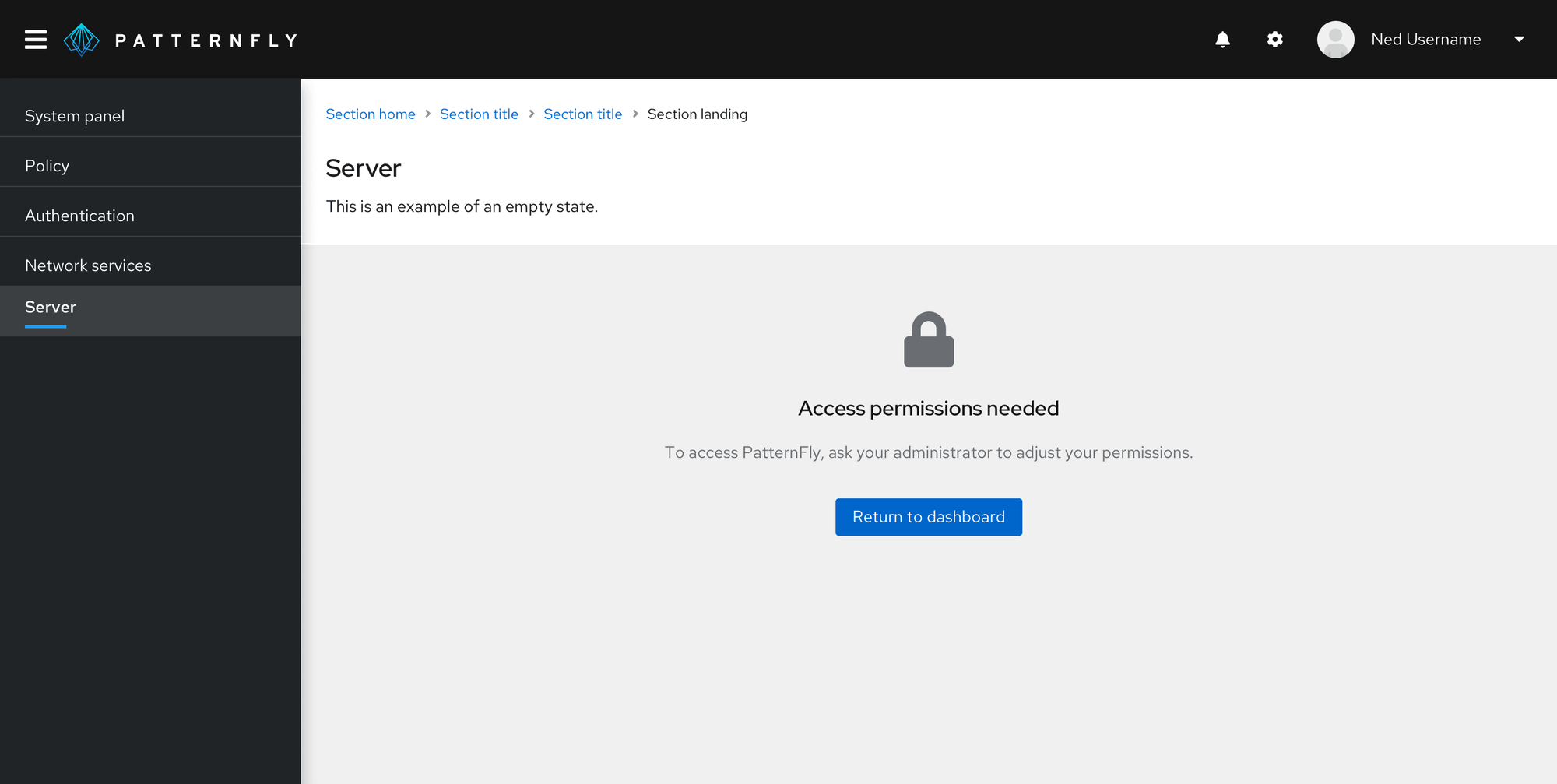
Errors
Sometimes the people will experience an empty state as part of an error. Most commonly due to lack of an internet connection or declining permissions to location.
This is another opportunity to make people aware that you know this can happen by having something more than ugly error text. It puts people at ease knowing that it’s probably not something they’ve done because there is something designed something for that specific case.
Democratising Design
One way to ensure that empty states are always covered is by creating a design system with guidance, examples, and all states of a particular component.
A design system allows designers to create a set of templates and instructions for when, where, and how empty states should be included. This aids developers who then have a clearer idea of the purpose of an empty state and can use existing designs to implement a better experience.
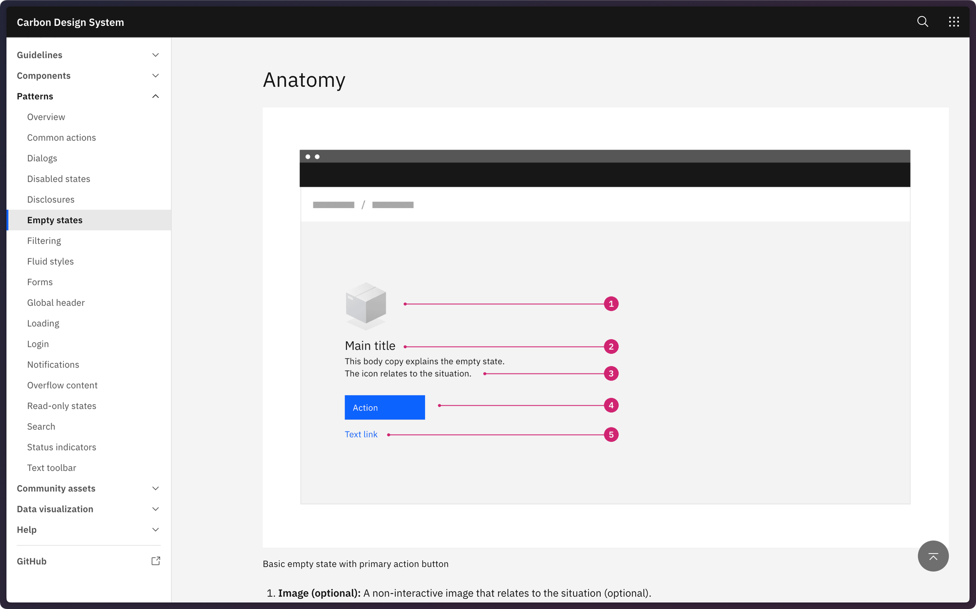
Just knowing empty state guidance exists ensures that when something doesn't quite fit the use-case, it's called out and gets addressed.
What next?
Pay attention to when users will see nothing, and give them something. An explanation, context, and an action to perform. Create, retry, or wait.
The important thing to remember is to make sure you add a layer of delight to your apps. Even the boring ones.
- Guide people on how to add data when there is none. A good idea is to break out of the conventional layout.
- Think about the goals people have when using your app. Will they clear data a lot or will it be a rarity? Design a nice surprise accordingly. If the state will appear frequently, consider having a few designs and rotate through them randomly for an extra level of delight.
- Provide context and actions along with errors. Do they make sense to someone who doesn’t know what they’re doing? Make them plain language with a clear action. Even if the action is to wait.
The details are what makes any app great. Delight your users and they will be much more forgiving if you make a mistake later on.
Contribute
If you have examples of well designed empty states, please submit them to http://emptystat.es including the app name and URL.